Work /

Steward Health Care

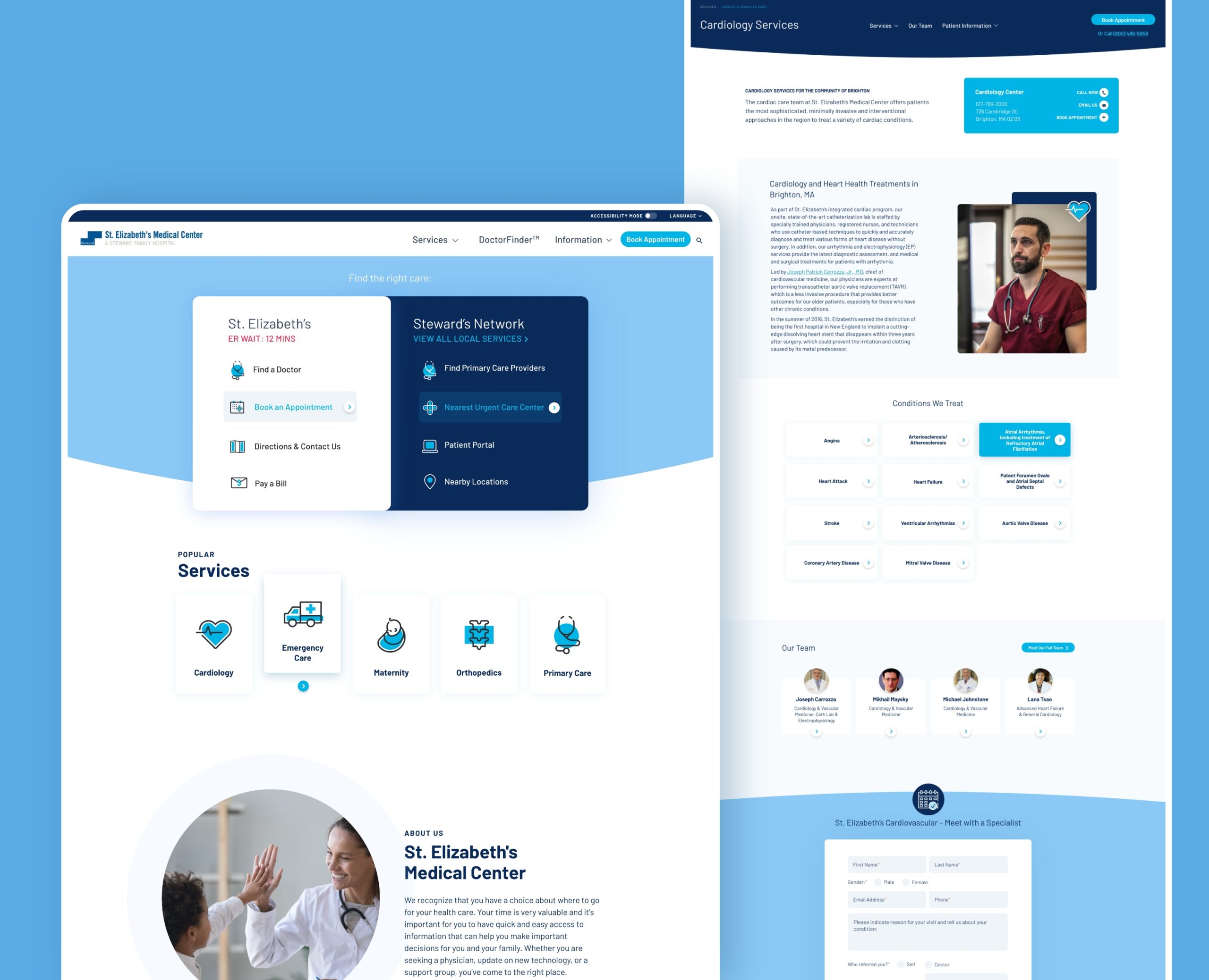
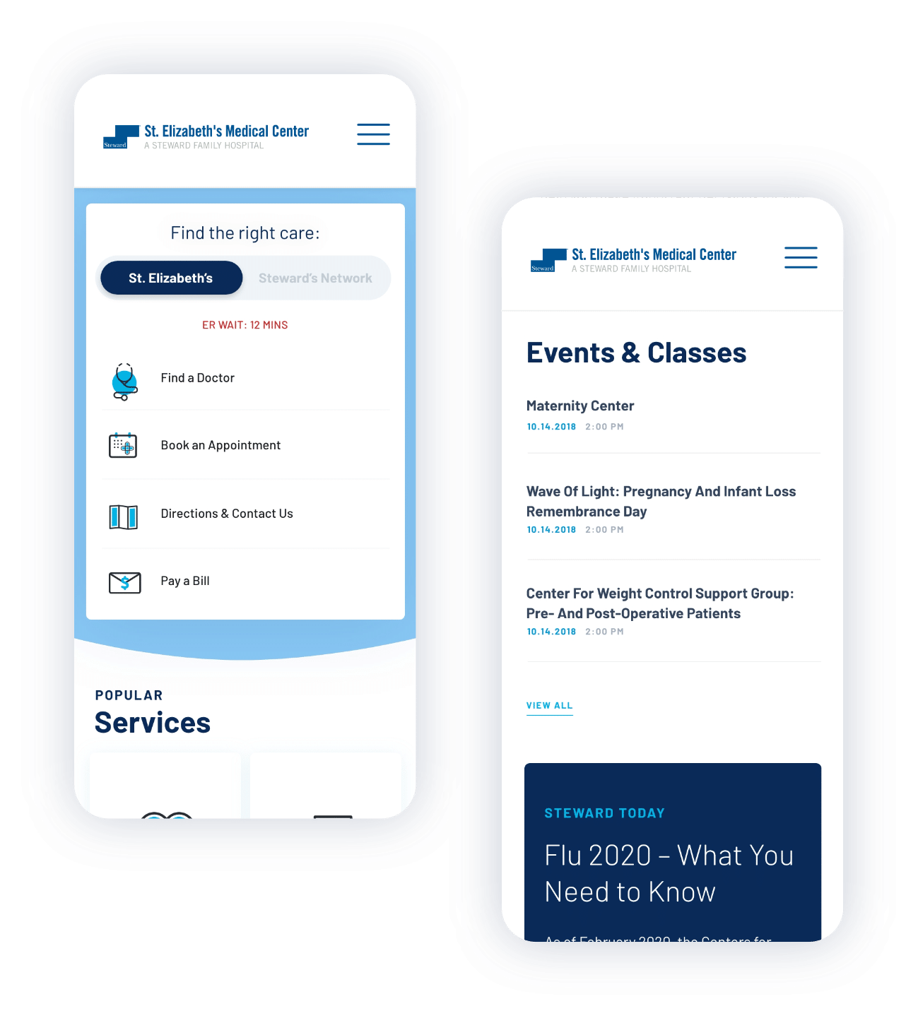
Steward Health Care Network approached Hatch looking for a digital solution to not only change how its brand is regarded on the web, but also how patients access information from its hospitals. After determining Steward’s target audience and that audience’s behaviors, Hatch set out to create a scalable web experience for 39 U.S. hospitals, 5 International and 5,000 physical network that delivered the right information, to the right patient, on the right screen.

SERVICES
WEB DESIGN
WEB DEVELOPMENT
VIDEO + MOTION GRAPHICS
COPYWRITING

Easy and Efficient Information Access

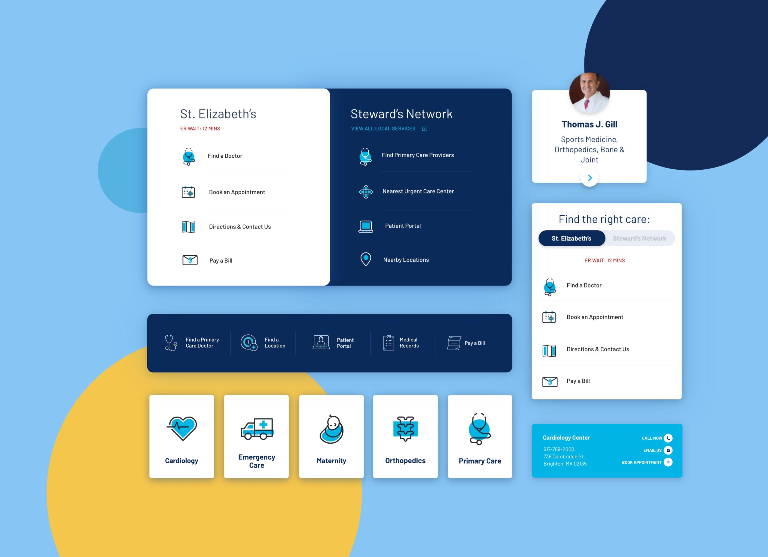
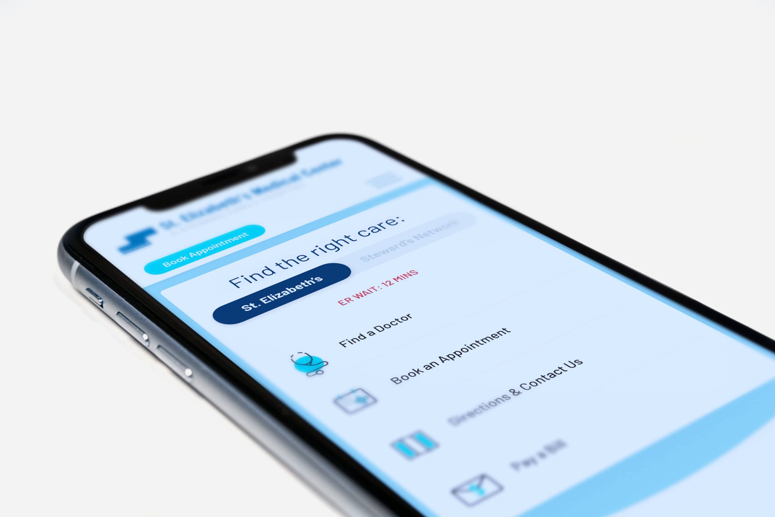
Find the Right Care—This one phrase is what the homepages across Steward’s corporate site and its nine hospital sites are based around. We designed our user-centric homepage menu to find out what users are looking for and help lead them to that place quickly and easily—whether it was in the hospital they already knew, or at one of Steward’s Network’s expanded offerings nearby.

Personalized Content Delivery

The web is getting smarter and more personalized every day. It’s time that the healthcare industry caught up to its more consumer-oriented counterparts to make digital advancements available to its patients. Hatch incorporated a personalization feature that learns a user’s behavior as they visit and return to a Steward site, serving up content that is relative to what they were looking for last time they visited, without them having to dig for it.

MODULAR DESIGN 

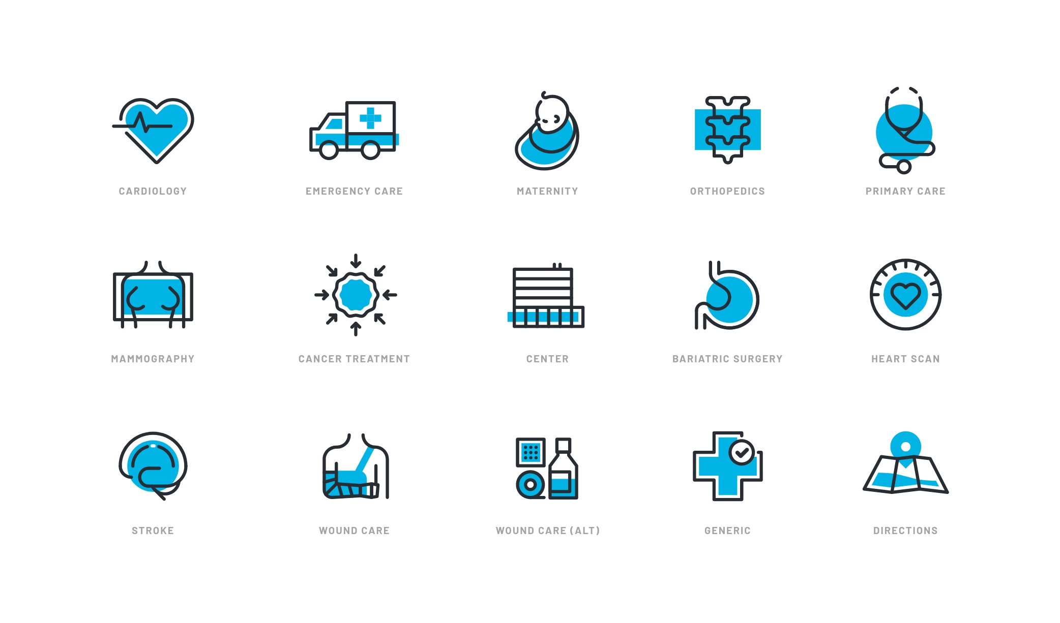
Understanding the full scale and future growth initiatives of the website, our design strategy went back to its foundation. We created a design system that accounted for each and every web element that might be needed, and then expanded it to allow for more complex modules. A page builder was implemented and made accessible so the client could also build additional pages on their own, plugging new content into the pre-designed modules. This allowed for optimal flexibility while also keeping the site consistent, user-friendly, and true to design.

DoctorFinder 

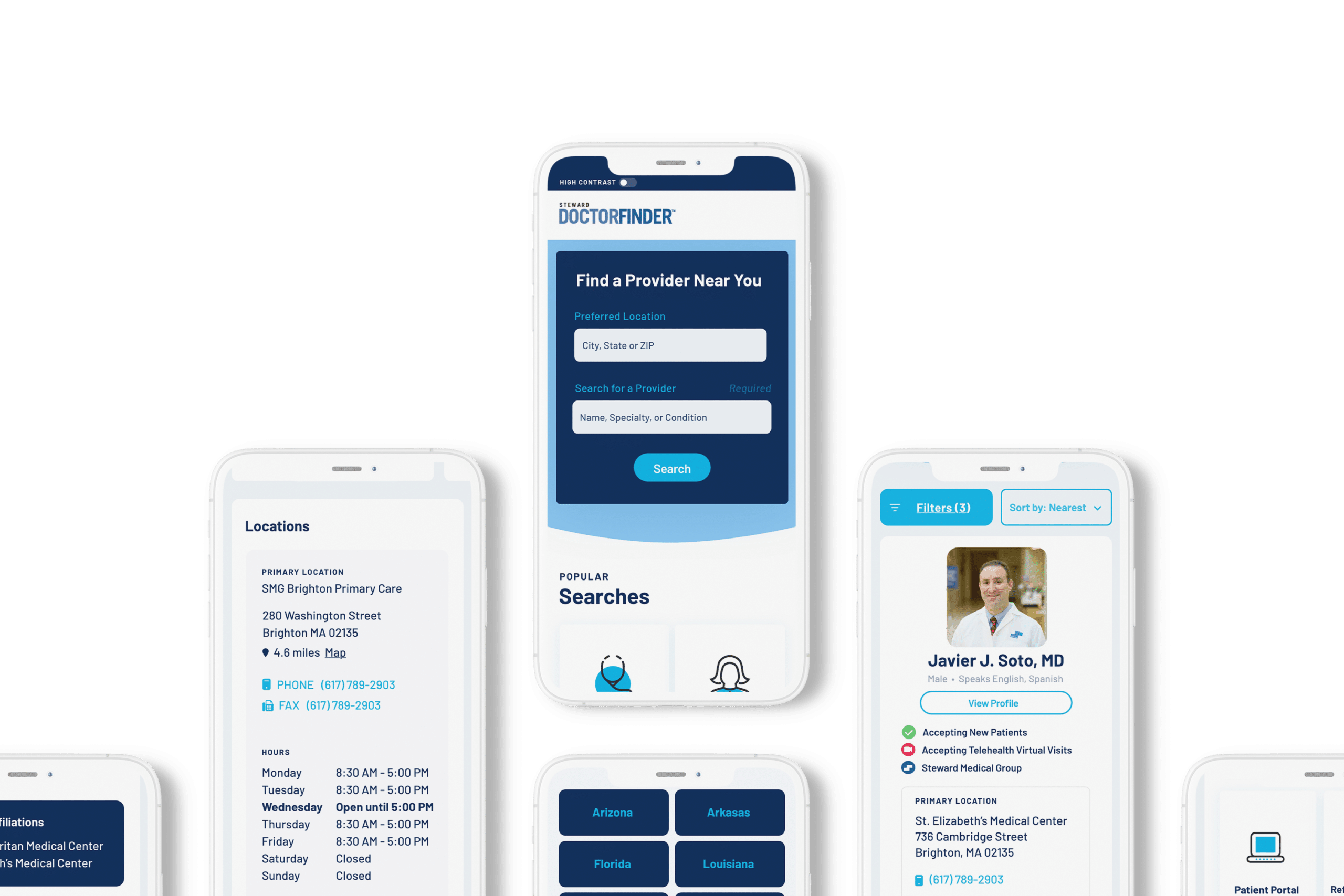
After several years of maintaining and iterating upon Steward’s digital experience, it was apparent that finding the right doctor was a key feature users were looking for. Hatch designed the complete user experience to help patients filter ands sort by exactly what they were looking for in a physician—down to gender, availability, language and more.

Steward’s Complete Family of Websites

In addition to the hospital websites, Hatch also designed and developed Steward’s Corporate site as well as Physician Group-Steward Medical group.

More Work