4 Graphic Design Trends We’re Loving Right Now

It’s no secret that our daily lives are surrounded by the ever-evolving presence of trends. We’re constantly bombarded with the fast-moving cycle of fashion styles (if low-rise jeans make a real comeback I SWEAR TO GOD), latest diet and exercise fads, and even whatever blink-or-you’ll-miss-it TikTok trend is going viral this week (don’t worry, you’ll see it on Facebook Reels in a couple months).

Many trends aren’t actually new or groundbreaking—in fact, a lot of the time we look to the past for inspiration—but rather what’s getting attention and gaining mass popularity in our current society.

However, innovations in technology“>do allow us to make forward-thinking advancements that could potentially catch on. For instance, new design programs or features allow creatives like us to expand our graphics and animation capabilities, thus opening the door to fresh ideas and visions. Like any environment, these can quickly spread in our industry and become more widely used.

With that being said, we thought we’d explore some of the graphic design trends we’re vibing with right now.

What makes a design trend?

Though there’s really no handbook outlining these types of things, we all seem to recognize a trend when we see it once and then see it again, and again, and again. It could be a certain color palette (thanks, Pantone Color of the Year!), typeface, or creative approach.

Like all trends, graphic design ones can vary in popularity and longevity. It’s best to put your time and effort behind a trend you think could hang around and continue to mature. And, while we don’t recommend hopping on trends that seem like a flash in the pan, there can be a time and place for them as well.

For example, see a trend you’d like to stick your creative flag into but not so sure it will last? Play around with it for a social media post as opposed to a website or longstanding piece of marketing material. Choosing the appropriate platform for a trend can be just as important as choosing the trend itself.

Why bother paying attention to trends?

This is a fair question, especially in the marketing industry where originality and authenticity aren’t only embraced, but also celebrated. However, as designers, we know that creative inspiration lives all around us. And, sometimes, that source of inspiration is a trend.

It’s easy to get in a rhythm; to fall into a pattern of only doing what you feel confident in. But we are firm believers in never getting too comfortable—we like to learn from other experts, other verticals, and especially from each other.

In fact, getting out of your comfort zone is the only way to grow! Remaining aware of trends is a great way for us to expand our horizons and try new things. Whether you work in an agency like us or are diversifying your projects as a freelancer, a trend might strike you as a perfect fit for a particular client. This can be an efficient and fun way to elevate a brand and give it relevancy without completely overhauling its style guide.

While trends alone don’t generate good design—basic principles will always be the foundation of our approach—they do offer a creative outlet. So, we suggest keeping your head up, eyes open, and ears to the street.

Now, onto the good stuff…

Graphic design trends

1. Combining 2D + 3D

Credit: Gimmick Studios on Behance

Typically, you’ll see designers commit to using either 2D or 3D elements in a single project due to both consistency and simplicity. The decision between the two usually depends on the purpose and medium of the design, as well as the designer’s abilities.

Much of the time, 2D is the preference for animation since it has high legibility and is easier to implement (relatively speaking). Alternatively, 3D provides a life-like depth to graphics that allows viewers to see more details at different angles. Hence, it’s common to see 3D used in video games, product models, and broadcasting initiatives (such as the effects you see during a televised sporting event) that benefit from spatial awareness.

Each serves its own purpose and has a solid place in graphic design. But what we’re into right now is combining the two elements in the same segment. It feels a little rebel-with-a-cause; like you’re breaking some unwritten rule, but with good reason.

Adding 3D components elevates the quality of a design without taking away from the versatility and familiarity of 2D. The trick is to be purposeful with your blend, making sure that the overall composition stays cohesive.

2. Mixing Mediums

Credit: Andrew Wiseman, Dribbble

Similar to combining 2D and 3D elements, we’ve been loving the impact that mixing a number of different mediums into one purposeful collage has on a design. This could be any compilation of visual components, such as flat graphics (icons, vector content, etc.), photography, 3D, varied textures, or typography. We especially appreciate how motion graphics help bring an assortment like this to life.

It seems like it would be all wrong (and, when not done correctly, it can be), but the end result is something new and interesting that collectively catches the eye while also drawing attention to the individual elements.

3. Looking to the Future (and the Past)
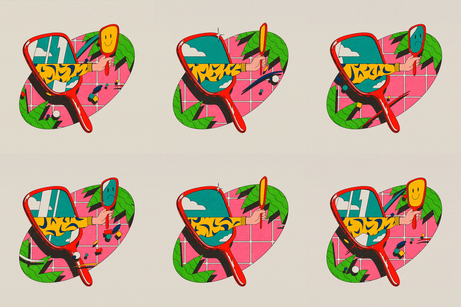
Credit: Josep Prat Sorella, Behance

It’s just plain fun to daydream about what a future world might look like; how technology and innovation will propel us forward into new territories. It’s something we’ve been doing since the 20th century (by the way, George Jetson was born in July 2022—feel old yet?) and will continue to do as we leverage our colorful imaginations as fuel for invention.

This is something we’re always doing as designers and, right now, it’s about anticipating how virtual reality, augmented reality, and immersive experiences will transform how we live our lives. But, while we keep our heads in the clouds, it’s also inspiring to look to the past at the designs that strike us as universally familiar.

Like we talked about before, the past has always been a catalyst for trends. All you need to do is turn on the TV to catch a glimpse of the number of shows and movies from past decades making a resurgence as reboots. Walk through the halls of an American high school right now and you’d swear you stepped back into 1999.

The same goes for graphic design. We’re seeing a lot of ‘90s minimalism, art deco, retro throwbacks, bold neons and geometric patterns of the ‘80s, and flat 2D illustrations. The use of these elements is powerful in that it stirs the feelings of nostalgia within us.

And, if you’re too young to remember, it’s still something fresh and exciting you’ve never seen before. It’s like the saying goes: “Everything old is new again.”

4. Abstract 3D Animation


Credit: Credit: 은서 choi, Behance

Sometimes the best things are the ones that make the least sense? There’s been a surge of using 3D motion graphics in bizarre, unexplained ways and we’re not mad at it.

While most of the time graphic design is used as a visual vehicle to storytell, this trend isn’t too worried about logic and instead is purely trying to create something interesting. The point is to make it so out of the box and new that it’s strangely memorizing. 

Most widely found in commercial spots or promotional materials that highlight a product or less-tangible concept, this approach is really just about grabbing eyeballs and keeping them engaged.

The bottom line

In marketing, trends can be a great way to help clients expand beyond their typical design style. However, it’s important to stay true to a brand and not just follow a fad because it’s “trendy,” but rather because you feel it’s a useful tool to make a relevant statement in a fast-paced environment.

For graphic designers specifically, being aware of trends can allow you to stay current with what’s happening in the creative world while also being introduced to new programs or approaches worth learning.

We think the trick is to use a trend as inspiration as opposed to dictation. Putting your own personal spin on a trend is what will help you stand apart from the crowd and solidify yourself as an independent thinker.

Who knows? You might just launch the next trend.
Finding Our Social Consciousness

As more late-stage millennials and Gen Z’ers enter the workforce, there has been a steady trend across industries to focus more on philanthropy and social consciousness. In fact, 75% of millennials say they are more likely to want to work for a company that actively gives back to the community.

The current generation’s “do-good” attitude has created a movement that has resonated all the way up to big companies, urging them to make a change not just because it looks good, but because it’s the right thing to do. Some studies even say it bolsters productivity and teamwork by enabling employees to build on critical skills while participating in something they care about. Talk about a win-win.

Many companies have taken this to heart and are looking at how they can best make a difference. Stella Artois’ partnership with Water.org was unveiled in an ad during this year’s Super Bowl, pledging that every purchase of a Stella Artois beer chalice will provide as much as five years of clean drinking water for a person in a developing country. Warby Parker has been donating one pair of glasses to a person in need for every pair sold for almost ten years, much like Toms has done with shoes. Microsoft started the YouthSpark program to empower young people by providing training in STEM areas and computer literacy.

And, though Hatch may be a smaller marketing agency (or “boutique” as some shops like to spin it), we always knew we wanted to give back in our own way.

When we first settled in Bridgeport three years ago, we could see how much potential the city had and knew right away that we wanted to do whatever we could to help it prosper. We vowed to one day establish a program to support the Bridgeport business community—one that would allow us to team with our neighbors to do some good.

We took the time to carefully look at our strengths and the needs of the community—and where those two might intersect.

It’s clear that it has become more important than ever for a business to have a solid brand identity and compelling digital marketing assets to be competitive in their given field. Unfortunately, many small and non-profit organizations lack the resources necessary to create and maintain a marketable brand, so they often fall behind. There are hundreds of small businesses in Bridgeport that aren’t getting the exposure they both need and deserve, and we’re out to change that in any way we can. At Hatch, we strongly believe that when one of us succeeds, we all benefit.
Which is why we hatched the Hatch Initiative four months ago.

Under the Initiative, small businesses in the Bridgeport area can apply by telling us their personal story. Once selected, Hatch donates up to $10,000 in billable time to provide branding, web design, content creation, or marketing assets—whatever is needed. In turn, we require a minimum fee, 100% of which is then donated to a charity of the business’s choice from our list of causes.

By helping to create a strong local business community, Hatch is hoping to write itself into a new history for Bridgeport—one that resurrects the hustle and bustle of the state’s largest city.

Three awesome companies are already working with us under the Hatch Initiative (meaning three charities are benefiting as well!)—take a peek at what we’ve done so far.

Branding and collateral for Phyto Haus, a shop for indoor gardeners


Curious to learn more? Go to the Hatch Initiative page to apply. 


A Farewell to Cat Videos: Facebook’s New Content Plan and What it Means for Your News Feed


Facebook has announced its latest update—and it’s a big one.

News feeds will now show more posts from friends and family, and fewer from brands and businesses. This is a move that founder and CEO Mark Zuckerberg says will encourage interaction, engagement, and more ‘personal moments.’

Here are some excerpts from his Facebook post on the change:

We built Facebook to help people stay connected and bring us closer together with the people that matter to us. That’s why we’ve always put friends and family at the core of the experience. Research shows that strengthening our relationships improves our well-being and happiness.”

Zuckerberg goes on to say that while many things that appear on your news feed may be entertaining, they aren’t contributing to your happiness or well-being, something he believes will be bolstered with more person-to-person interactions.

Facebook’s goal is to reduce passive engagement, such as watching a few seconds of a video or skimming through an article and then moving on to the next post. Instead, it hopes to increase likes and comments on personal posts, returning Facebook to the era of 2009-2012, when news feeds were primarily populated by posts from friends.

“…while many things that come up on your news feed may be entertaining, they aren’t contributing to your happiness or well-being.”

Mark Zuckerberg, Facebook Post

And while that all sounds warm and fuzzy, this will have a colossal impact on brands and businesses that rely on the social media platform for organic marketing and customer outreach.

Facebook’s change will force followers to go directly to a business’ page on their own accord, as it will no longer automatically show up in their news feed. To many businesses, this seems like a portent of doom—because honestly, how many people will actually click to their pages unprompted?

Brand pages will also be severely affected. Posts from popular pages like Buzzfeed will no longer show you Tasty videos, and CNN won’t routinely show you that day’s news. Instead, followers will need to visit these individual pages and search out what they want, or find an alternative source of information.

Ironically, Zuckerberg actively anticipates a drop in total time spent on Facebook: “By making these changes, I expect the time people spend on Facebook and some measures of engagement will go down. But I also expect the time you do spend on Facebook will be more valuable.”

This change is a next step in the attempts to dispel the Facebook ‘bubble of fake news’— where people are only shown news and opinions that already support their beliefs—by eliminating the news from your feed altogether. But, many brands stand to be severely (or fatally) impacted, especially those like Upworthy, Diply, UNILAD, and Buzzfeed, who rely heavily on Facebook for social traffic.

Not surprisingly, sponsored posts or paid ads don’t stand to be disturbed, so brands will always have the option to pay for traffic. This means that your news feed will still be chock-full of sponsored content.

At first glance, this change comes across as positive and human-connection affirming. But on further inspection, it starts to seem high-handed, unnecessary, and money-hungry.

The Facebook news feed has naturally evolved over the years to reflect what people desire from their social media—a mix of personal posts from people they care about, up-to-date news and entertainment, and light visual content. Thousands of users report depending on Facebook as a primary news source (over 67% of Americans), and to remove this as an option seems detrimental to Facebook as a brand.

This also demonstrates to users that they really have no control over what they see on their feeds. It’s a grim reminder that Black Mirror isn’t as much of an alternate reality as we’d like to think.

It will be interesting to see the results of this adjustment—unfortunate loss of listicles and animal videos aside—and see how organizations adapt to yet another disruption in social media marketing.

What We Learned from “Design Disruptors”

“Art and design are completely different. Art is about making questions- design is about making solutions…in design, you have to make sense.”

The film Design Disruption explores the new world of design, and how today’s designers—and the world’s perception of design—are shifting approaches, methods, and philosophies to adjust to the new expectation of out-of-this-world excellence in design.

Part of the issue is that so much of the actual work and knowledge that goes into modern design is kept behind closed doors, so the world is largely unaware of all the expertise it requires—and thus design is undervalued because people view it as ‘magic’ that occurs with, say, the swoop of a digital stylus.

But there is much more to design than a pretty interface. The true beauty of design comes when something works, and works well. Beauty is surface-level and low on the totem pole in the design world—if it’s pretty now, it won’t be in a year or two, and there will be real issues if there is something fundamentally wrong.

Designers must also consider familiarity when creating new products—anything that’s too foreign runs a high risk of rejection from the public, particularly products that include a level of potentially uncomfortable social situations, like AirBnB or Uber.

Even Apple must carefully tread this line—when the first iPhone came out, people were taken aback. No keyboard? Everything on a single screen? Internet?!

And so Apple had to come up with very targeted, guiding marketing that led users to a point where they could comfortably approach the iPhone, like the ‘calamari commercial’ of 2007 that featured a simple walk-through of the phone’s main features that started with a familiar pop culture reference in The Pirates of the Caribbean.

The idea of disruption comes from a long-held tenet of designer belief—your best ideas come when you’re a little uncomfortable. We wouldn’t have beautiful design if we stayed inside comfort zones. This creed has been in operation since long before Ben Franklin stood in a rainstorm with his kite, and continues to guide creation across disciplines from technology to furniture.

Recently, however, disruption has come to find a more literal definition. Designers are seeing entire industries as being in need of a shake-up—when only a small number of people at the top are benefiting, it’s time for a disruption.

Or when they see something that everyone has become accustomed to not working as well as it could- like thermostats stuck on a wall, or subpar public transportation. These are hotspots for designers to come in and interrupt the flow and remind people that hey, things don’t need to plonk along like this- they can be great, they can be beautiful.

They just need a little disruption.

Find out more and watch the film Design Disruptors by InVision here.

Local Agency Hatch 130 Named Winner of Global Acquia Engage Awards

 FOR IMMEDIATE RELEASE:

Bridgeport digital agency honored for redesign of Steward Health Care digital properties  

BRIDGEPORT, C.T. (NOVEMBER 10, 2016) — Hatch130, a full-service marketing and design agency, announced today that it has received a global Acquia Engage Award in the healthcare category. Hatch 130 has been awarded for the recent redesign of Steward Health Care’s family of websites and creating an innovative, user-friendly experience for patients.

The annual Acquia Engage Awards honor sites and digital projects across 13 categories that demonstrate unprecedented design and functionality to inform, inspire, and engage users. Hatch130 and the Steward sites were recognized out of more than 150 submissions and 88 finalists worldwide.

Steward Health Care, based in Boston, Massachusetts, is the largest fully integrated healthcare services organization and community hospital network in New England. Steward and its nine hospitals employ over 17,000 healthcare professionals across more than 150 communities.

Steward is one of the first in the healthcare industry to fully evaluate the gaping holes in its digital presence and put forth the time and effort to fill those holes and create an unmatched patience experience.

With an early 2016 launch, Steward Health Care commissioned Bridgeport-based digital agency Hatch 130 to develop an intricate strategic and implementation plan to upgrade its family of websites—including its corporate site and the websites for each of its nine hospitals in the Boston area. Being that healthcare has historically been an industry requiring doctor-lead, face-to-face communication, Hatch1 30 sought to find a more consumer-friendly way of providing important information to Steward’s patients who now have more access to case studies and content.

“It was critical that we looked at the behaviors of both consumers and healthcare patients in today’s digital society,” said Scott Lilly, Principal, Hatch 130. “From there, we were able to identify what information was most important to Steward’s audience, determine how to present that information in an effective way, and make educated predictions about the ways in which patients would engage with the sites. Steward is one of the first in the healthcare industry to fully evaluate the gaping holes in its digital presence and put forth the time and effort to fill those holes and create an unmatched patience experience.”

By looking at industries outside of healthcare’s competitive landscape, Hatch 130 was able to assess what successful companies were doing in the digital space, as well as identify key goals for the new Steward sites. It was critical that the new online properties exhibited a responsive, mobile-friendly design to accommodate users on the go. It was also important to cut down on the overwhelming amount of subject matter, which typically includes a large percentage of medical jargon. Hatch130 worked closely with Steward to make both content and navigation streamlined and condensed, as well as introduce user-friendly videos to make information easily consumed and shared.

Victorious agencies announced in other categories included VML (Xerox) and IDEO (City of Boston, Department of Innovation and Technology). Each winning project was evaluated for visual design, functionality, integration and overall digital experience. To see a full list of Acquia Engage Awards winners visit www.acquia.com/about-us/newsroom/press-releases/acquia-announces-winners-2016-acquia-engage-awards.

To learn more about Hatch130, visit hatchold.wpengine.com.


About Hatch130
Hatch130 is a digitally-minded marketing + creative agency based in the heart of downtown Bridgeport, CT. With an emphasis on innovation, Hatch130 delivers a full range of integrated marketing services to a diverse client portfolio. Offerings include web development, graphic design, digital and interactive solutions, social media, production, public relations and strategic media placement. Hatch Ideas. Hatch Emotions. Hatch Connections. To learn more, visit http://hatchold.wpengine.com.

About Steward Health Care
Steward Health Care is the largest fully integrated healthcare services organization and community hospital network in New England. Headquartered in Boston, Steward is the fourth largest employer in MA with more than 17,000 employees in more than 150 communities. Steward is comprised of Steward Medical Group, Steward Health Care Network, and Steward Hospital Group. Steward Medical Group provides approximately 1 million patient encounters per year in 152 sites and manages homecare and hospice with 300,000 and 35,000 encounters respectively. Steward Health Care Network, a fully integrated care management company, has 3,000 physicians, with approximately 4 million patient encounters per year and affiliates or joint ventures with approximately 30 urgent care centers. Steward’s Hospital Group includes Saint Anne’s Hospital in Fall River, Holy Family Hospital in Methuen, St. Elizabeth’s Medical Center in Brighton, Norwood Hospital, Carney Hospital in Dorchester, Good Samaritan Medical Center in Brockton, Nashoba Valley Medical Center in Ayer, Holy Family Hospital in Haverhill and Methuen, Morton Hospital in Taunton, and New England Sinai Hospital in Stoughton. Additional information is available at steward.org.


Contact:
Taylor Raasch
203-842-2315
taylor@hatch130.com

Documenting Client Communication

We’ve all experienced that sinking feeling when something goes wrong at work. Your first thought is usually something along the lines of: oh no, did I mess up? Here are a few simple steps I follow to avoid any of those dreaded he said/she said situations:

1. Email Folders

I take a lot of pride in my email filing system – each client gets a folder and within those are additional folders for each job. Sometimes the volume of emails can be overwhelming so having a system helps to make things more manageable. Also, with all of these folders, I’m able to quickly find an email whenever there are questions or disagreements.

2. Follow-Up Notes

With so much communication through email these days, it’s nice to be able to speak to clients on the phone or sit down face to face. However, it’s important to create a paper trail when things are not done over email. As soon as I finish up a call or an in person meeting, I send off an email detailing the key points of the phone call and next steps. Also, I request confirmation from my clients and/or colleagues that we all had the same takeaways.

3. Get Approval in Writing

I know it drives my clients crazy sometimes and I sound like a broken record, but I ALWAYS get approval in writing. The following words/phrases, while nice to hear, do NOT count as final approval:

Looks great
Love it
Thanks
Perfect 

After a few times of having me email “Please write back with written approval”, clients usually get in the routine of using the word “approved” and everyone’s lives become easier.

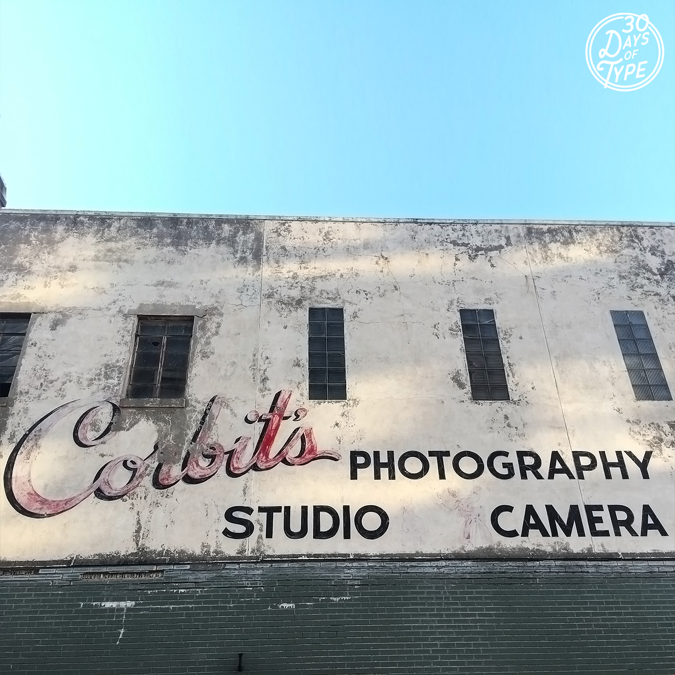
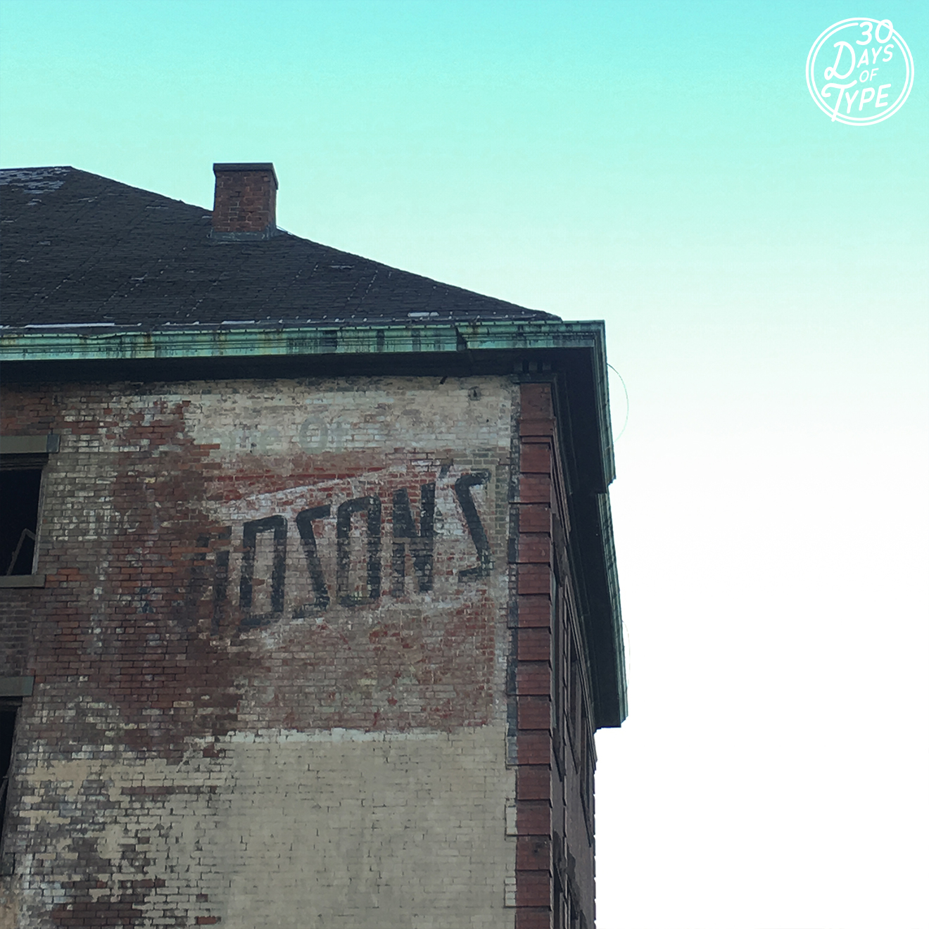
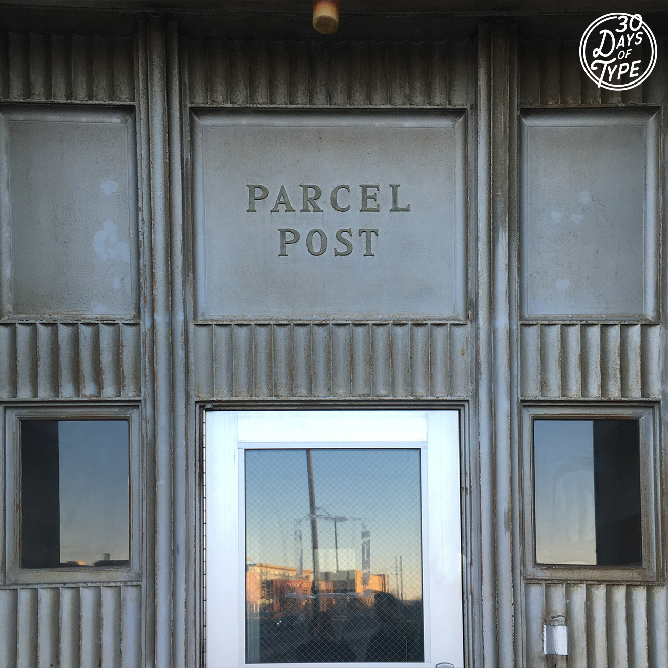
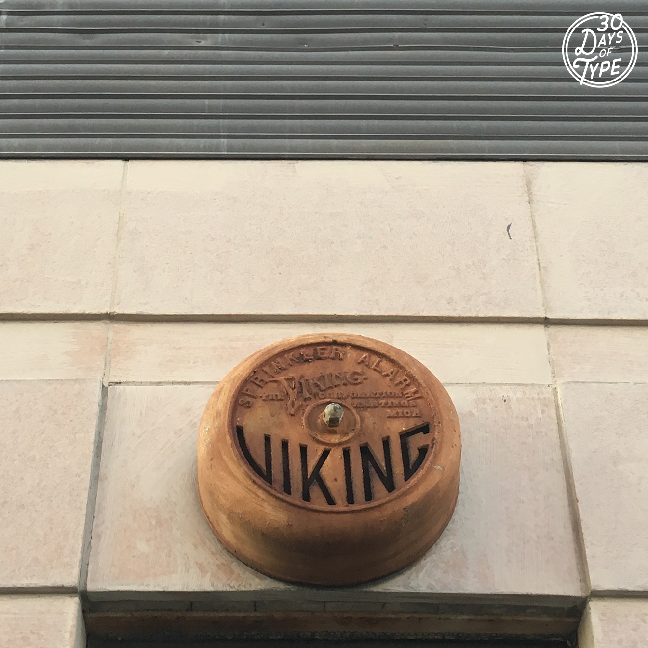
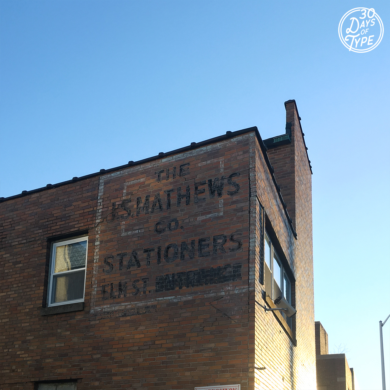
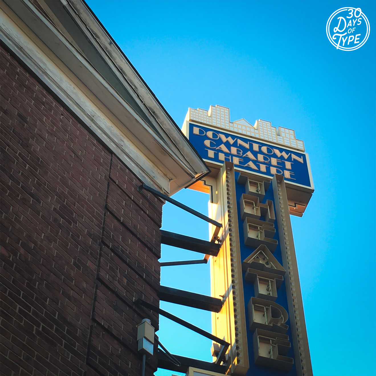
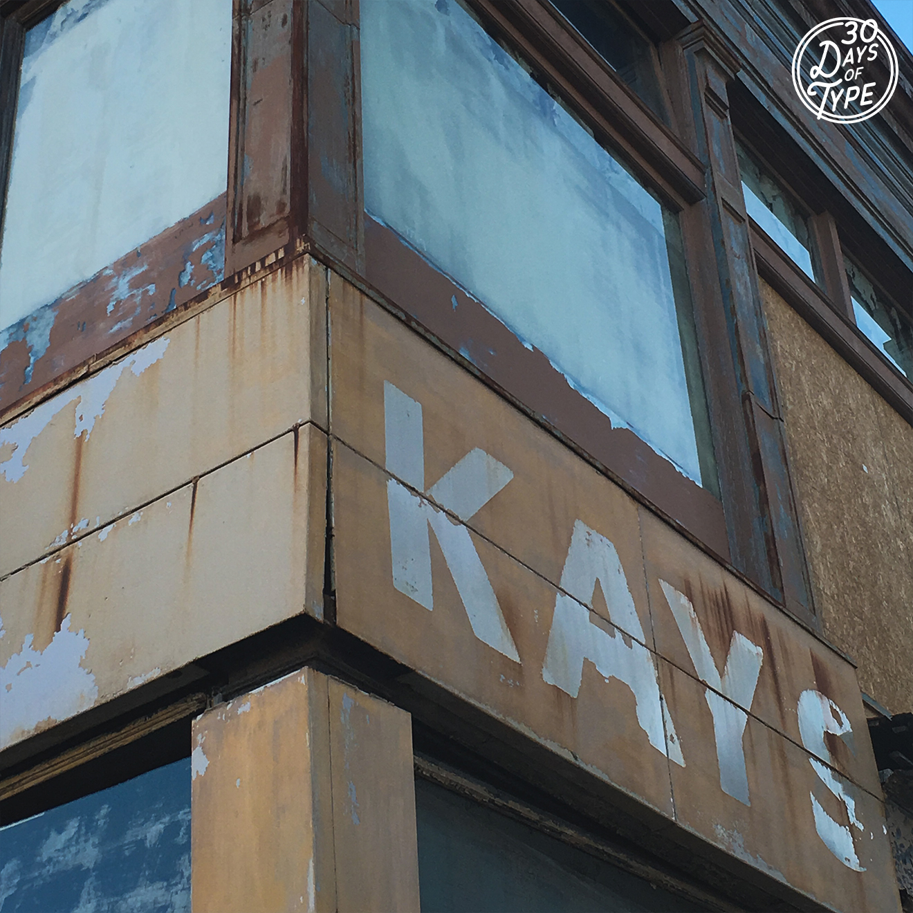
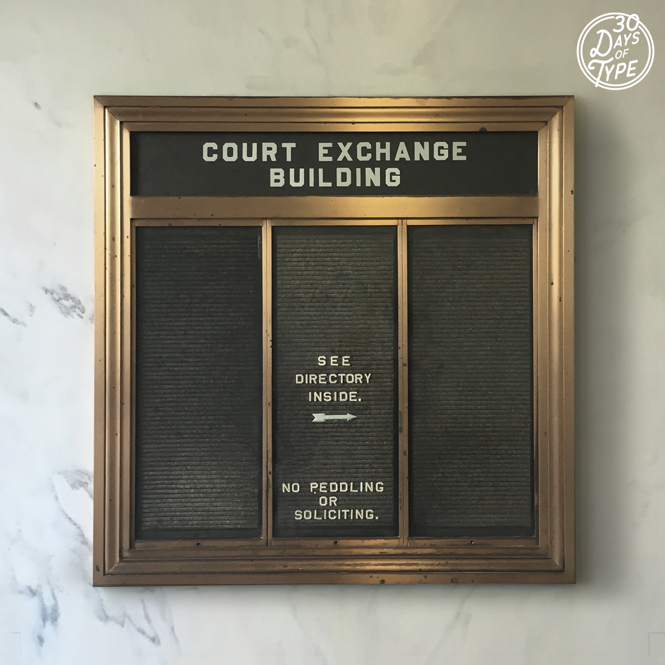
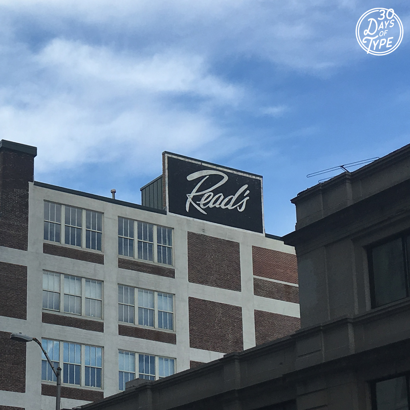
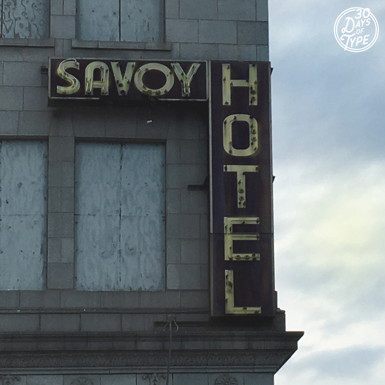
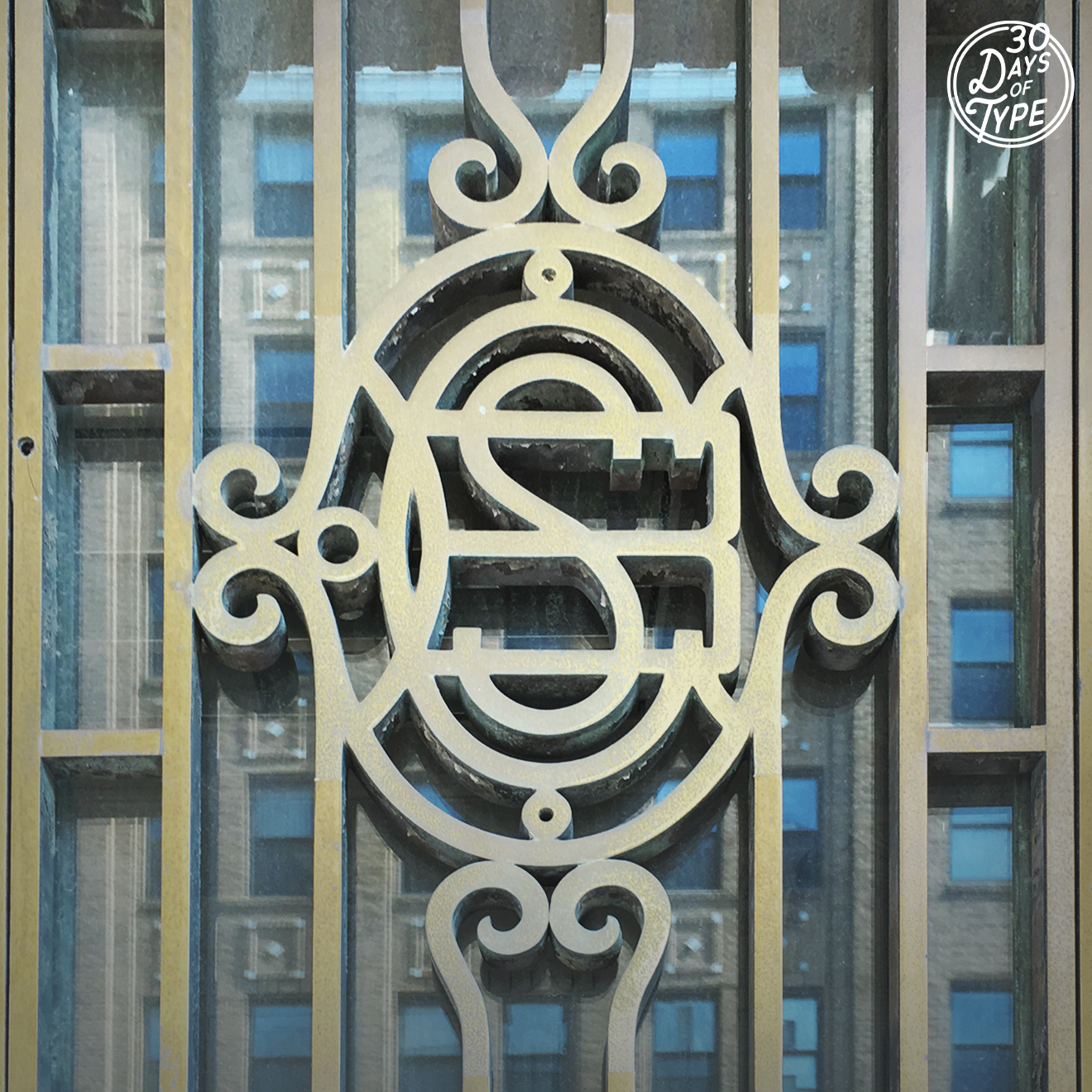
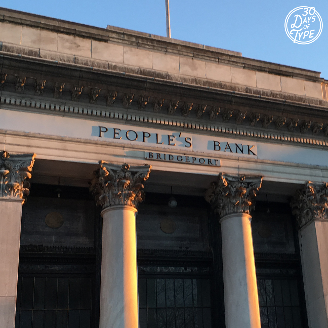
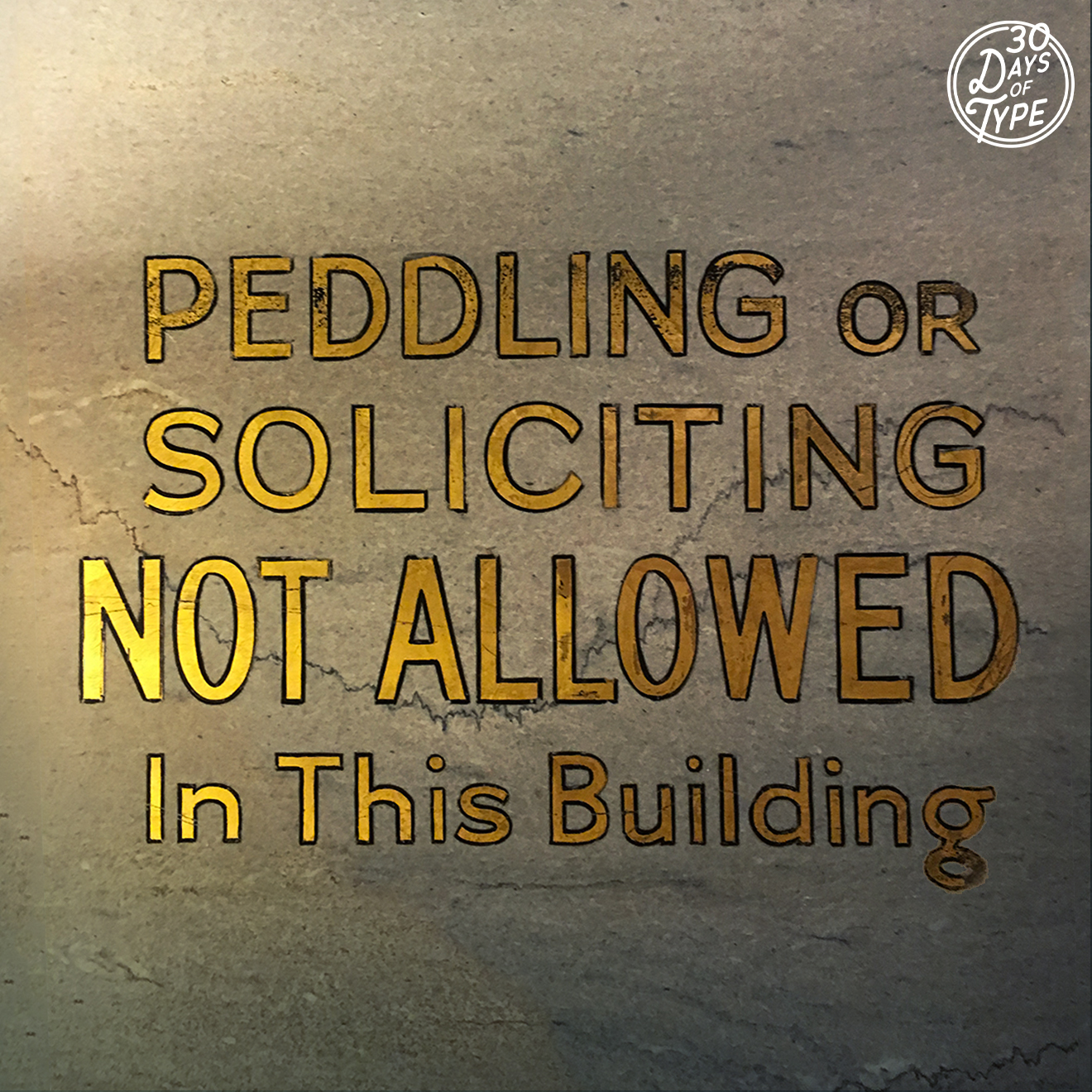
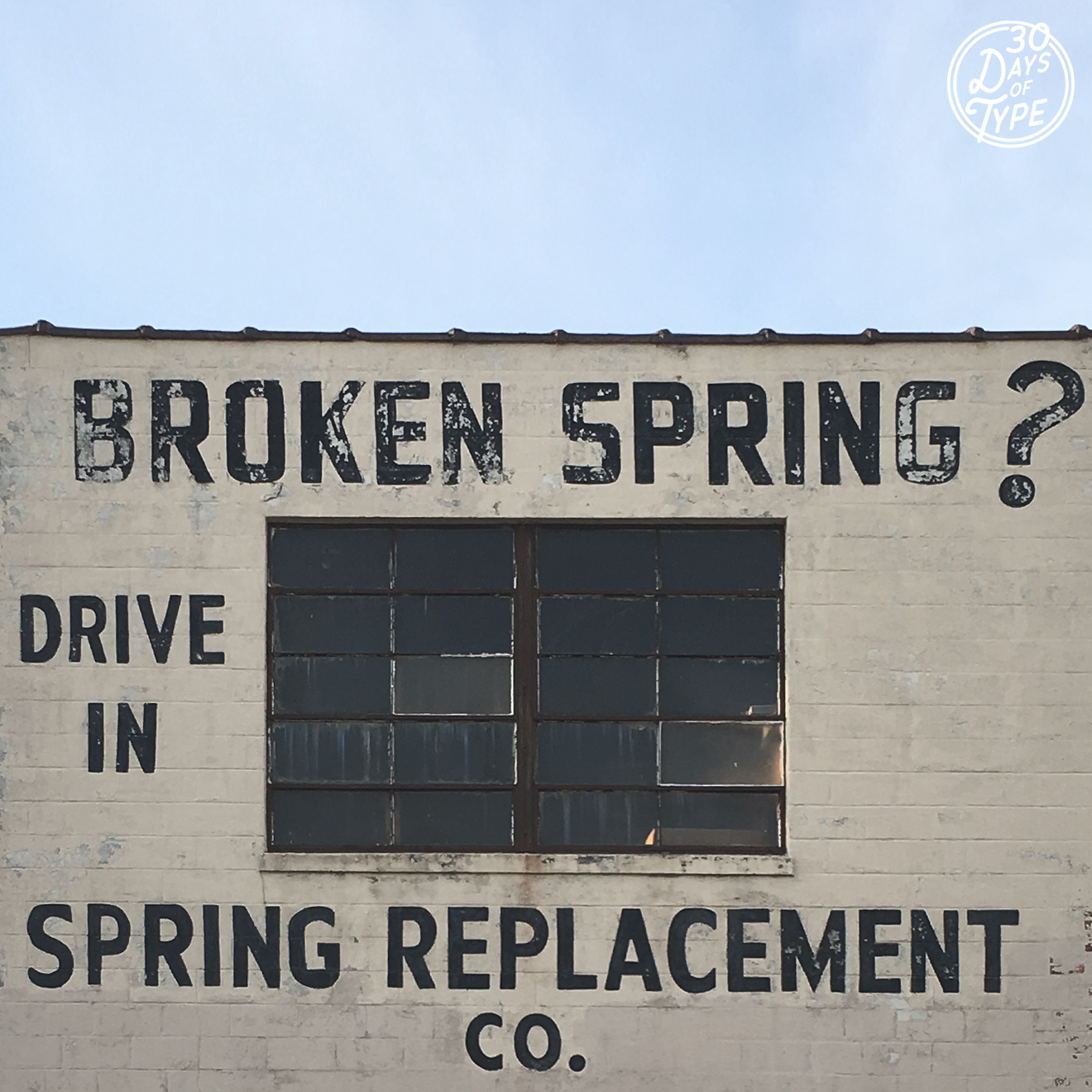
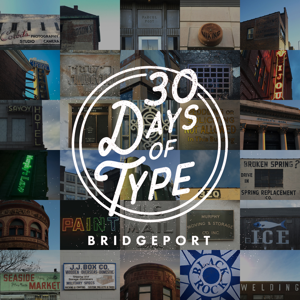
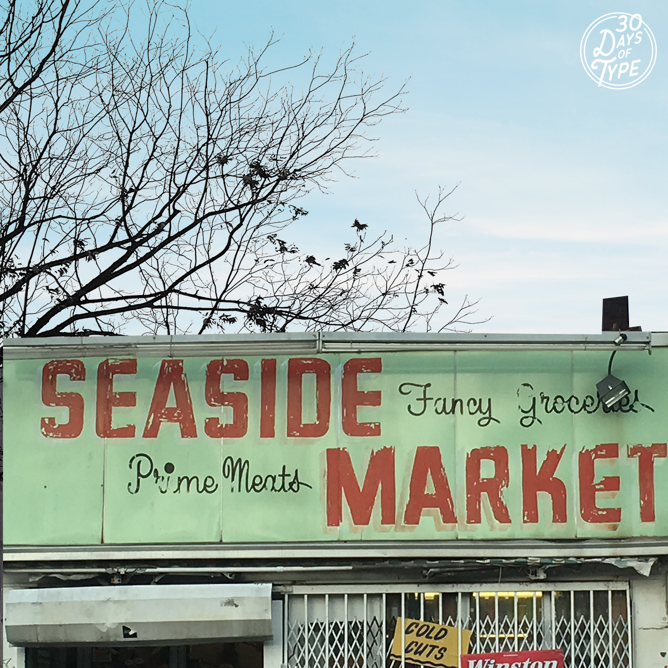
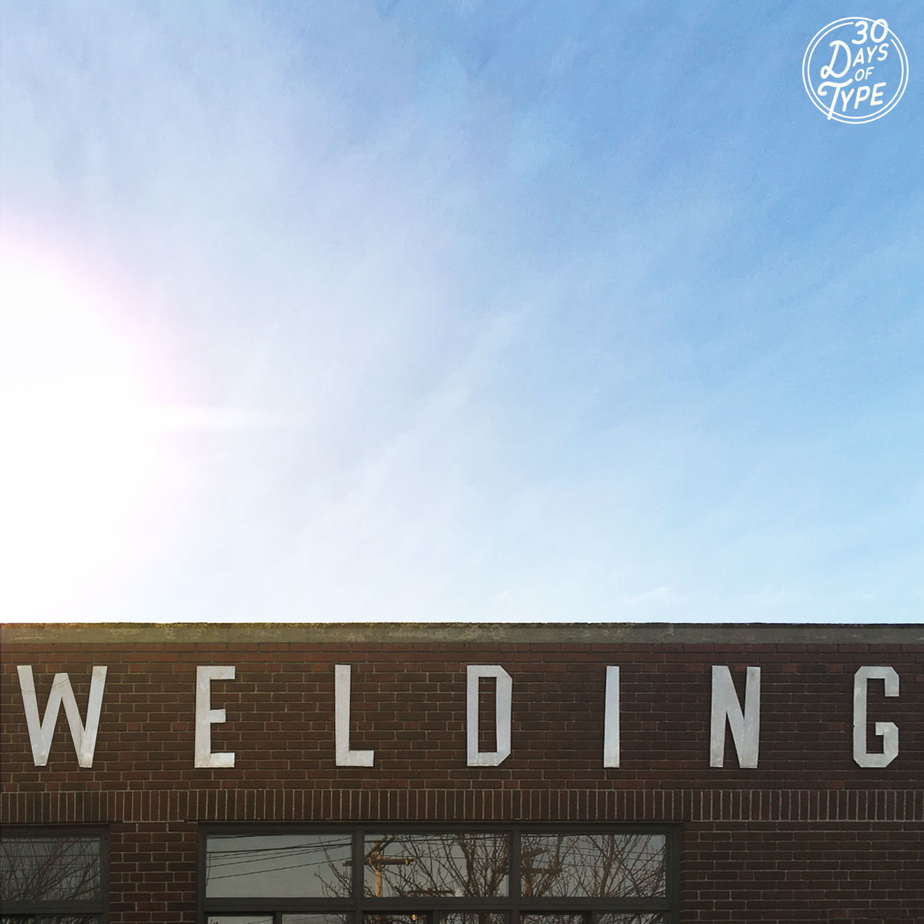
30 Days of Type

We’ve challenged ourselves to seek out creative typography in Bridgeport for the next 30 days! Check back daily on our Instagram to see the unique type we have found in our city. Want to join us? Tag pictures of your city with #30DaysOfType.